
Where Should the Three-Dot Menu Open on a Phone?
A dropdown that works on a desktop gets cut off at the bottom of a phone. Six ways to show a row's actions, how Apple and Google do it, and a playground to try each one.
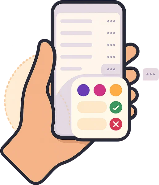
Every list in an app has the same little button: three dots at the end of the row. Tap it, and you can edit, share or delete that item. On a desktop it just works. On a phone, near the bottom of the screen, it often doesn't.
I found this building my own phone apps. On a desktop there is lots of room, and you can see the whole screen. On a phone, I tapped the three dots on the last row and the menu opened downwards, off the screen. The options were small and hard to hit with a thumb.
So I tried the other ways. There are six worth knowing. Try them yourself below: same list, same actions, six patterns.
Playground
Try all six on the same list
Mia's 5th birthday
Sat 10:00 · Jungle room · 18 kids
Leo turns 7
Sat 12:30 · Ocean room · 22 kids
Ava & Noah
Sat 15:00 · Jungle room · 30 kids
Kindy end-of-year
Sun 09:30 · Whole venue · 45 kids
Oliver's 4th
Sun 11:00 · Ocean room · 15 kids
Isla turns 6
Sun 13:30 · Jungle room · 20 kids
Harper's party
Sun 16:00 · Ocean room · 12 kids
Jack turns 8
Mon 15:30 · Jungle room · 16 kids
Grace's 3rd
Tue 10:00 · Ocean room · 10 kids
End of bookings
Plain dropdown
Try it: Tap ⋯ on one of the last rows. The menu opens downwards and runs off the screen.
- Apple
- Not used on iPhone
- Menu (without repositioning)
- On the web
- A menu absolutely positioned under the button
- To edit
- 2 taps, if you can see it
- ✓ Best for
- A desktop, with a mouse and plenty of room
- ✗ Watch out
- Cut off near the bottom; small rows are hard to hit with a thumb
Tick 8 actions and tap the last rows to see where each one breaks. Tick thumb reach to see why the bottom of the screen matters.
Six ways to show a row's actions
| Apple calls it | Google calls it | On the web | |
|---|---|---|---|
| 1. Plain dropdown | Not used on iPhone | Menu | A box under the button |
| 2. Smart dropdown | Pull-down menu | Menu that repositions | Radix, Floating UI, CSS anchor positioning |
| 3. Bottom sheet | Action sheet | Modal bottom sheet | <dialog>, Vaul Drawer |
| 4. Press and hold | Context menu | Long press | Timer + right-click |
| 5. Swipe actions | Swipe actions (Mail) | Swipe actions (Gmail) | Pointer events |
| 6. Open the row | Detail screen | Detail screen | A link to the item's page |
Apple and Google never just drop a menu downwards. Their menus measure the room first, or the actions come up from the bottom.
When each one fits, and where it breaks
| Best when | Watch out | |
|---|---|---|
| Plain dropdown | Desktop, with a mouse | Cut off at the bottom; small targets |
| Smart dropdown | A few safe actions | Still far from the thumb on top rows |
| Bottom sheet | Phones; many or risky actions | Covers the list, so name the item |
| Press and hold | A shortcut for daily users | Invisible unless someone tells you |
| Swipe actions | One or two actions, many times a day | Hidden; easy to swipe by mistake |
| Open the row | Many actions, or ones that need explaining | One more screen, one more Back |
How I choose: the four F's
I ask four questions about the actions, and the answer picks the pattern.
- 1
Few and safe? → Smart dropdown
Three or four actions, nothing you can't undo. It flips up when there's no room below.
- 2
Frequent? → Swipe, plus the dots
Something done all day, like Archive. Swipe for speed, and keep the dots for people who never swipe.
- 3
Fatal? → Bottom sheet
Delete, cancel, refund. Big buttons near the thumb, the item's name at the top, and Undo afterwards.
- 4
Full? → Open the row
Seven actions, or ones that need a sentence of explanation. Give them a page.
Tip
Press and hold is a bonus, never the only way
Apple's context menu is lovely, but nobody can see it. Add it as a shortcut on top of one of the four, never instead of them.
My favourite is the bottom sheet. Big buttons near the thumb, and it's the right place for anything risky, like delete.
Try this today
- Open your app or website on your phone
- Scroll to the last row of a list and tap its three dots
- Can you see every option, and hit each one easily with your thumb?
- If not, flip the menu up, or move the actions into a bottom sheet
About the author. Bach Ly is a software engineer with 17+ years building websites and applications for teams at Cochlear, CommSec, Pepper Money and ResMed, and now builds web applications and online integrations through KoalaDigital. More about Bach.