 Sample — fictional business, real format
5 September 2026· KD-AUD-0512
Website Review Reportfor Northside Blinds & Shutters
- Website
- northsideblinds.com.au
- Business type
- Blinds & shutters, made to measure
- Service area
- Brisbane northside
- Platform
- WordPress
- Pages reviewed
- 9
- Checked on
- Desktop & iPhone
- Trading since
- 2009
- Prepared for
- Marcus Reid, Owner
- Reviewed by
- Bach Ly, KoalaDigital
Judged against one goalRequest a quote
What we looked at
- Home pageSee what's working
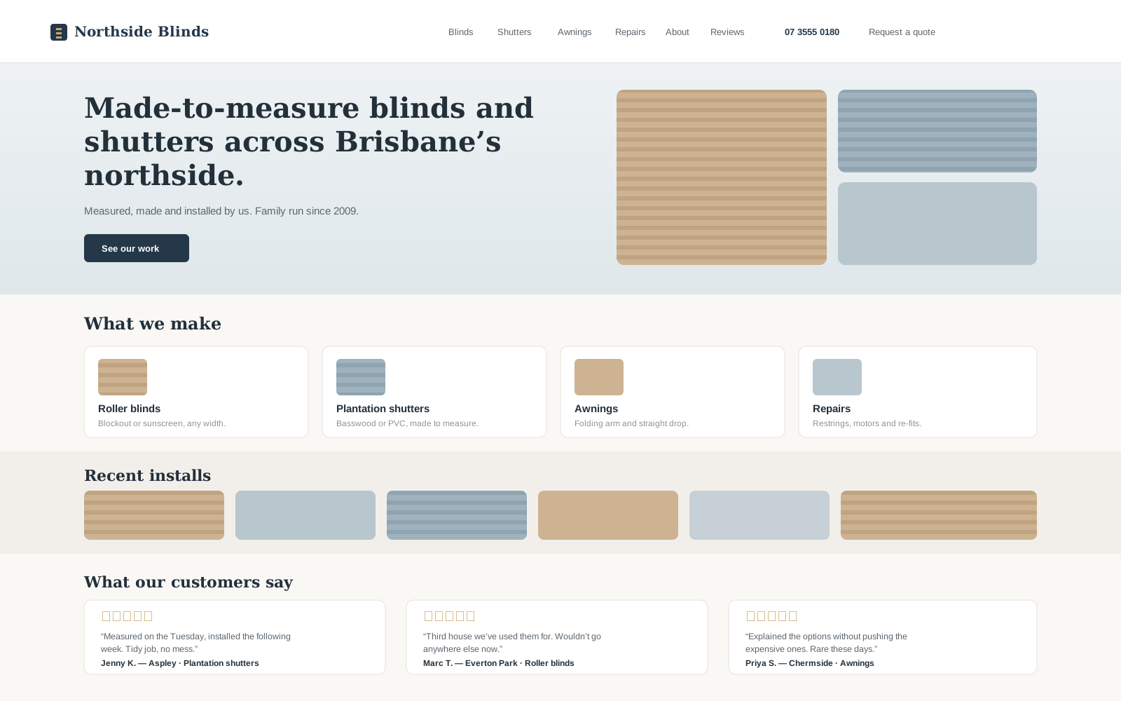
Your home page, as it looked on the morning of the review. - Working well
- Opportunity
- Make the main action more obviousSee the opportunities
The top of the home page. The only quote link is in the corner. - Working well
- Opportunity
- Say roughly what things costSee the opportunities
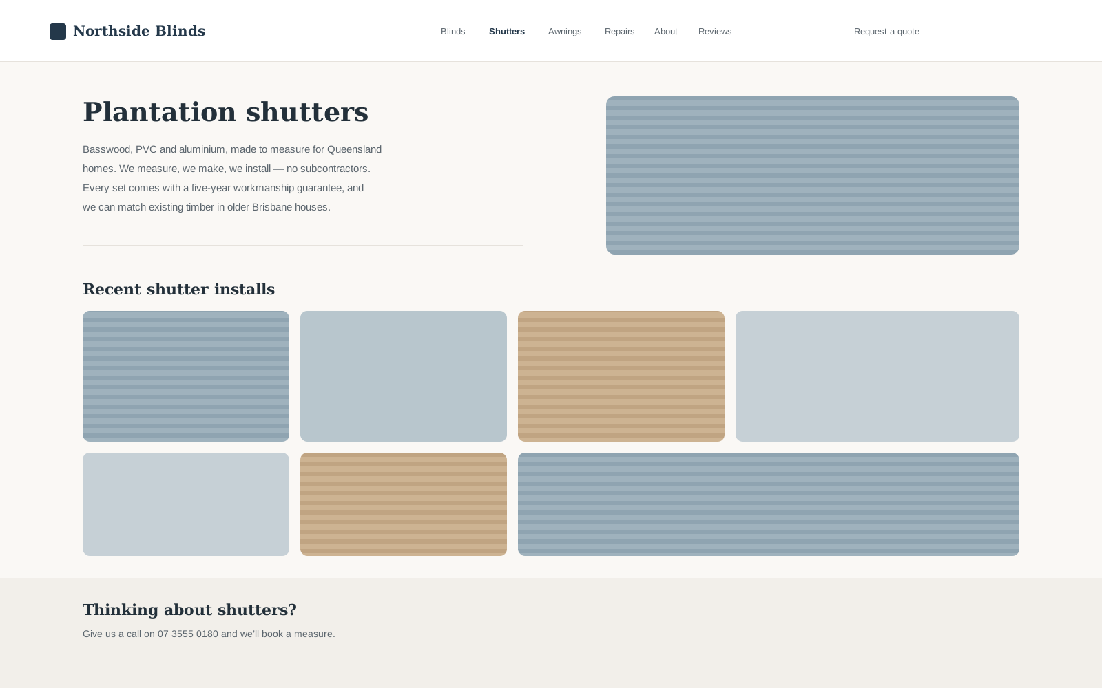
The shutters page. Good description, no indication of cost. - Working well
- Opportunity
- Shorten the quote formSee the opportunities
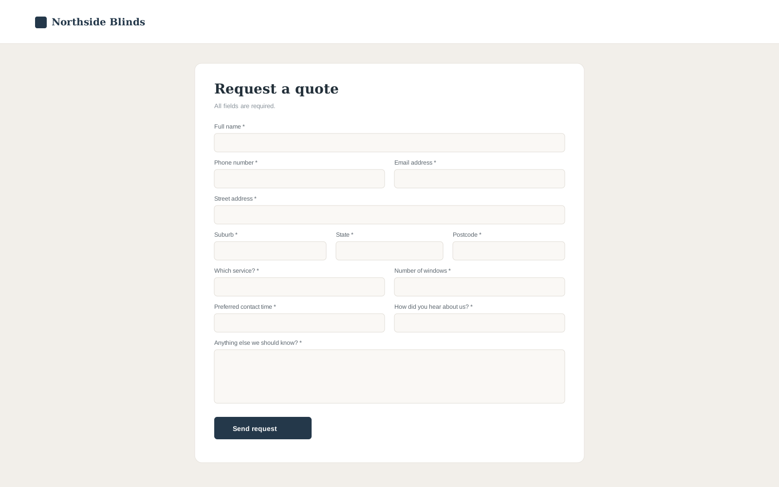
The form as it stands. Eleven required fields. - Working well
- Opportunity
The verdict
You're on the right track.
There's a lot here I'd keep. Your site explains what you do in plain language, the photography is your own, and the reviews on the home page are the real thing with names attached. That is a better starting position than most of the sites I look at, and it means what follows is adjustments rather than a rebuild.
Read the 60-second verdict
- Working well7things to protect
- Opportunities3worth doing
- Leave alone6not worth spending on
- Local AdsOptional, later
How it stacks up
Context, not a grade
Website foundation
StrongCustomer clarity
StrongTrust
GoodAction journey
OpportunityEverything above is a summary. Tap any figure to jump to the detail.
01The 60-second verdict
There's a lot here I'd keep. Your site explains what you do in plain language, the photography is your own, and the reviews on the home page are the real thing with names attached. That is a better starting position than most of the sites I look at, and it means what follows is adjustments rather than a rebuild.
Three things are worth your attention, and one of them costs nothing but half an hour. The rest of what I found, I'd leave alone — including two things I suspect you've been told to change.
Everything in this report is judged against one goal: getting someone to request a quote. If a change wouldn't move that, it isn't in here.
Video walkthrough
Watch my 5 min walkthrough
I recorded a quick walkthrough showing what stood out and what I'd work on first — it's easier to show you than to write it down.
Bach Ly, KoalaDigital
02Protect these
Working Well
Before talking about changes, let's protect the things you've already got right.
- Working well
- Leave alone
And the things a screenshot can’t show
These came out of using the site rather than looking at it.
It works properly on a phone
I went through the whole site one-handed on an iPhone and nothing broke, nothing overflowed, and the text was readable throughout. That is not a given.
It loads quickly
Just under two seconds to show the main content on a phone over 4G. Whoever built this compressed the images properly — that is real work and it has been done well.
Your Google Business Profile is well looked after
Hours, service area, photos and recent reviews are all current. For a local trade this often matters more than the website, and yours is in good shape.
03Worth doing
Opportunities
You could find dozens of tiny things to change on almost any website. These are the ones I'd actually spend time or money on.
Before the detail — here is the journey from someone finding you to an enquiry landing in your inbox, stage by stage.
Arrive → Understand
GoodYour headline and service cards do this well. Someone landing cold knows what you sell and where you work almost immediately.
Understand → Trust
GoodYour own photography and nine attributed reviews. This part is genuinely strong and I wouldn't change it.
Trust → Decide
Moderate frictionNothing on the site indicates cost, so someone comparing three quotes can't tell whether you're in their range without filling something in.
Decide → Act
Moderate frictionThe quote link is a menu item, and on a phone it's hidden inside the menu. Someone who has decided has to go looking.
Act → Enquiry sent
Significant frictionEleven required fields including a postal address. This is the one place in the journey where I'd expect real, avoidable drop-off.
A leak doesn't mean that visitor would definitely have become a customer. It means we've found avoidable friction, distraction or uncertainty on the way to the one thing you want them to do.
Make the main action more obvious
What I saw
On the home page, "Request a quote" appears once, in the top-right corner, at the same size and weight as the other menu links. On a phone it's inside the menu, so it isn't visible at all until someone taps to open it.
What I’d change
Make it a solid button rather than a link, keep it visible on a phone without opening the menu, and repeat it at the bottom of each service page. Same words, just harder to miss.
Why it matters
You told me a quote request is the one thing you want from the website. At the moment a visitor has to go looking for it, and the people least likely to go looking are the ones who aren't yet sure about you — which is most first-time visitors.
Effort
Small
Potential impact
Large
Rebuild
No
- Working well
- Opportunity
Say roughly what things cost
What I saw
There's no price indication anywhere on the site. Every path ends at a quote form, which asks for a phone number before it says anything about money.
What I’d change
Add a from-price or a typical range to each service page. Something like "Most plantation shutter jobs land between $X and $Y per window, depending on size and finish" is enough. You don't need a price list.
Why it matters
People asking for blinds are usually getting three quotes. Anyone unsure whether you're in their budget either fills in a form to find out — which is work — or leaves and asks someone who told them. A range costs you the enquiries that were never going to buy and keeps the ones that were.
Effort
Small
Potential impact
Medium
Rebuild
No
- Working well
- Opportunity
Shorten the quote form
What I saw
The quote form asks for eleven things, including a full postal address, a preferred contact time and how the visitor heard about you. All eleven are required.
What I’d change
Ask for four: name, phone or email, suburb, and what they're after. Collect the rest when you call them back — at that point they're happy to answer, because they've already decided to talk to you.
Why it matters
Every question asked before someone is committed is a chance for them to stop. A postal address in particular reads as an odd thing to hand over for a price, and it is not information you need in order to ring someone back.
Technical measurement: 11 required fields; 3 of them are not used before first contact
Effort
Medium
Potential impact
Large
Rebuild
No
- Working well
- Opportunity
04Save your money
Leave Alone
Some of these will have been suggested to you before. I'd keep your money in your pocket on all of them.
Your logo
Leave it
It's clear, it reads at small sizes, and it's on your van and your quotes. Rebranding is a large cost with no effect on whether someone requests a quote.
Your website platform
Leave it
It's doing everything you need and it's fast. Moving platforms would cost thousands and change nothing a customer can see. If anyone tells you the platform is the problem, ask them which customer complained about it.
Your main navigation
Keep it
Four services, About, Reviews and Contact. People arriving from Google and word of mouth want to look around, and your menu lets them.
Your blog
Leave it
Six posts, last one two years ago. It isn't hurting you and nobody is judging you for it. Writing more would take real time and would not bring you blinds work.
Adding live chat
Don't bother
For a made-to-measure trade where every job needs a measure anyway, chat mostly generates questions you'd rather answer on the phone. Skip it.
Your About page photo
Keep it
You and the van, in front of a real house. It's more convincing than anything a photographer would produce in a studio.
Between the platform migration and the rebrand, that's the two most expensive things anyone is likely to suggest — and neither would change what a customer does on your site.
05What to do
Your Plan
Everything above, in the order I'd actually do it. This page is the one to forward to whoever looks after your website — it says what to do, why, roughly how long, and it doesn't assume they'll do it our way.
If this were my business — Bach Ly
First
Do the quote button this week. It's half an hour, it needs nobody's permission, and it's the single most useful change on the list.
Then
Then stop and leave it alone for a month or two. Your site is doing its job, and the two remaining items are worth doing properly rather than quickly.
When you're ready
If you ever decide to advertise, set up measurement before you spend a dollar on clicks — not after. Everything else can wait until you know what's actually happening.
1
Do this first
2
Do these next
2
Worth doing when you're next in there
1
Protect these
1
Don't spend money on
Do this first
1- 1
Turn the quote link into a visible button, including on a phone
It's the one thing you want visitors to do, and right now it's the hardest thing on the page to find. About thirty minutes.
Effort
Small
Who could do it
Your web person · Any developer · KoalaDigital
Do these next
2- 1
Add a price range to each of the four service pages
Answers the question every quote-shopper has before they'll fill anything in.
Effort
Small
Who could do it
You
- 2
Cut the quote form from eleven fields to four
The largest avoidable drop-off between a visitor deciding to enquire and actually doing it.
Effort
Medium
Who could do it
Your web person · Any developer · KoalaDigital
Worth doing when you're next in there
2- 1
Add the two most recent Google reviews to the home page
Yours are good and current. Not worth a special trip.
Effort
Small
Who could do it
You · Your web person
- 2
Put the service area suburbs in the footer
Answers "do you come to Albany Creek?" without an enquiry.
Effort
Small
Who could do it
You · Your web person
Protect these
1- 1
Your photography, your reviews, your navigation and your Google Business Profile
These are the reasons the rest of this list is short. Any change to the site should leave all four alone.
Effort
Small
Who could do it
You
Don't spend money on
1- 1
Rebranding, changing platform, restarting the blog, or adding live chat
None of these would change what a customer does, and two of them are expensive. See the section above.
Effort
Small
Who could do it
You
In total: Around five hours of work altogether, and the first item is about thirty minutes of it.
Who could do this
Three ways forward, and they're all legitimate.
Do it yourself
The price ranges and the review updates are genuinely a you job — you know the numbers and you know the customers. The quote button depends on your platform, but it's usually a settings change rather than code.
Give this report to your web person
It's written so someone else can work from it. The plan is the part to send: it says what to do, why, roughly how long, and it doesn't assume they'll do it our way.
Ask KoalaDigital to help
If you'd rather it was just done, these are the two things we do.
Local Ads Funnel — $495
One focused page for one local customer journey.
Google Ads Setup — $300
Campaign, tracking and measurement, set up properly from the start.
06The website's job
So, is your website good enough?
Yes — with a few worthwhile improvements.
Your website has a broad job to do. People reach it from a Google search, from your Google Business Profile, from a neighbour's recommendation, from the sign on your van, and from customers you did work for three years ago who are back for the bedroom.
Those people arrive with completely different questions. One wants to know if you do awnings. One wants to see whether your work looks good. One already trusts you and just wants your number. A website that tried to force all of them down one path would serve most of them badly.
That is why your navigation is a feature and not a fault. It lets each of those people find their own answer.
- Google search
- Google Business Profile
- Referrals
- Word of mouth
- Your van
- Past customers
- Direct visits
Your website
- Blinds
- Shutters
- Awnings
- Repairs
- About
- Reviews
- Contact
Let them explore.
08One last thing
If You Ever Pay For Clicks
Navigation is useful when people are exploring.
Focus is useful when you're paying for the click.
Everything above is about the people who find you on their own. If you ever advertise, that's a different situation: someone types "plantation shutters brisbane", clicks your ad, and that click costs you money whether or not they contact you. You know exactly what they want, and you paid to bring them in for that one thing.
Sending them to a home page offering four services isn't wrong — it's just a page built for exploring being asked to do a job it wasn't designed for.
You're not currently advertising, so none of this is urgent. If you ever do, the honest read on where your site sits is below — and the thing to fix first is measurement, because nothing on the site currently records a completed enquiry.
Where you sit
Good foundation
The pieces are there. A little focus would sharpen them.
Readiness, by part
Search match
GoodYou genuinely do the thing people search for.
Trust
StrongReal reviews, real photos. Nothing to fix.
Mobile
StrongWorks properly one-handed. Better than most.
Focus
OpportunityFive other paths available from the landing page.
Measurement
Needs setupNothing currently records a completed enquiry.
Your website doesn't have to do everything.
It has to make one thing easy.
For you, that one thing is:
Request a quote.
This report is yours
- Use it yourself
- Give it to your developer
- Give it to another agency
- Feed it to AI
- Or ask KoalaDigital
Our job is to help you understand what we'd keep, what we'd improve, and what we wouldn't waste money on. What you do with it is entirely up to you.